Friday, October 21, 2011

Simple Lightbox effect with CSS – no javascript needed

You may call it Lightbox, or Greybox, or Thickbox, but it's always the same effect.

When you are on a page, and click on a photo or trig some event, a Lightbox is an effect that fades the pagein the background to show you new content in the foreground.

I mean this effect

Lightbox

In the upper example, when clicking on a photo the site fades to black and shows the photo, in the lower one when clicking on "login" the site fades to white and shows the login form.

There are tons of Lightbox scripts in the web, each one with its unique features and limitations, but all require massive use of Javascript or the installation of javascript frameworks.

In some cases, there are "lightweight" versions with "only" 40KB of Javascript.

This example does not want to compete with those scripts, but if you are looking for a simple, 100% CSS, 0% javascript lightbox, this may help you.

Features of this Lightbox:

100% CSS as said
You can insert any content in it (some scripts out there only allow images) and easily upload your codes to your web hosting provider.

That's all. Did you need something more? Think wisely…

Let's start with the CSS

 1 2 3 4 5 6 7 8 9 10 11 12 13 14 15 16 17 18 19 20 21 22 23 24 25 26 27 
 .black_overlay{  display: none;  position: absolute;  top: 0%;  left: 0%;  width: 100%;  height: 100%;  background-color: black;  z-index:1001;  -moz-opacity: 0.8;  opacity:.80;  filter: alpha(opacity=80); }   .white_content {  display: none;  position: absolute;  top: 25%;  left: 25%;  width: 50%;  height: 50%;  padding: 16px;  border: 16px solid orange;  background-color: white;  z-index:1002;  overflow: auto; }

The black_overlay class is the layer that will make the web page seem to fade. It's a black 80% opaque background as long and wide as the browser that will overlay the web page (look at the z-index) and at the moment is not shown (look at the display).

The white content class is the layer with the photo/login screen/whatever you want to appear in the Lightbox overlay. It's a white layer to be placed over the black_overlay layer (look at the z-index, greater than the black_overlay one). The overflow allows you to have a scrollable content.

In the html file, put this line just before the tag

 1 
 <div id="light" class="white_content">Hi, I am an happy lightbox</div><div id="fade" class="black_overlay"></div>

Now, trig the action you want to open the Lightbox and insert this code:

 1 
 document.getElementById('light').style.display='block';document.getElementById('fade').style.display='block';

For example, in a link would be:

 1 
 <a href = "javascript:void(0)" onclick = "document.getElementById('light').style.display='block';document.getElementById('fade').style.display='block'">Click me</a>

Remember to include in the lightbox the code to close it, for example

 1 
 <a href = "javascript:void(0)" onclick = "document.getElementById('light').style.display='none';document.getElementById('fade').style.display='none'">Hide me</a>

A complete example page could be

 1 2 3 4 5 6 7 8 9 10 11 12 13 14 15 16 17 18 19 20 21 22 23 24 25 26 27 28 29 30 31 32 33 34 35 36 37 38 39 
 <!DOCTYPE html PUBLIC "-//W3C//DTD HTML 4.01 Transitional//EN"> <html>  <head>   <title>LIGHTBOX EXAMPLE</title>   <style>   .black_overlay{    display: none;    position: absolute;    top: 0%;    left: 0%;    width: 100%;    height: 100%;    background-color: black;    z-index:1001;    -moz-opacity: 0.8;    opacity:.80;    filter: alpha(opacity=80);   }   .white_content {    display: none;    position: absolute;    top: 25%;    left: 25%;    width: 50%;    height: 50%;    padding: 16px;    border: 16px solid orange;    background-color: white;    z-index:1002;    overflow: auto;   }  </style>  </head>  <body>   <p>This is the main content. To display a lightbox click <a href = "javascript:void(0)" onclick = "document.getElementById('light').style.display='block';document.getElementById('fade').style.display='block'">here</a></p>   <div id="light" class="white_content">This is the lightbox content. <a href = "javascript:void(0)" onclick = "document.getElementById('light').style.display='none';document.getElementById('fade').style.display='none'">Close</a></div>   <div id="fade" class="black_overlay"></div>  </body> </html>

That you can find up and running in this page.

In this example everything is static and preloaded, but you can easily add some php/ajax code to make it more dynamic while keeping the effect 100% CSS based.

Hope you will find it useful, should you use it in one of your works send me a comment and I'll feature your site as example.

Tuesday, October 18, 2011

Mobile Web Design Tips and Tricks

Having a mobile-optimized web site can really make your site stand apart from the pack. Even though smartphones like the iPhone and Google Android devices can display "the full web," having a web page formatted for smaller screens and with features that can take advantage of a touch screen, geolocation, or address book functionality can make the mobile web browsing experience that much better.

Even just a few years ago, optimizing websites for mobile browsers was a painful and difficult process, in part because of the limitations of most mobile browsers. Today, thanks to the proliferation of WebKit (which powers the browsers on the iPhone, Android and webOS devices, with BlackBerry expected to join the mix next year), it's much easier to decide on a strategy for making your website pop on mobile platforms.

We've put together a toolkit of resources for the designer and non-designer alike to get you started. Did we miss your favorite tool or service? Let us know in the comments!


Services for Optimizing Your Content for Mobile Browsers


mash-mobile-lg

If you don't have experience with HTML and CSS (or you don't have the time), there are a number of services that can create mobile versions of your website for you.

MoFuse and MoFuse Premium — MoFuse has been offering a simple way for bloggers and businesses to easily create mobile versions of their websites for quite some time. For bloggers or smaller sites, the company offers MoFuse for Blogs, which is a free and easy way to quickly mobilize your web site (it uses your RSS feed to generate the new site) whenever it is accessed by going to "m.yourdomain.com." For businesses or larger sites that want a little more control, MoFuse Premium offers more customizable options.

Disclosure: MoFuse powers Mashable's mobile website.

Mippin — Mippin is another free service that can create a quick mobile version of your website using your RSS feed. The options aren't extensive, but the version that Mippin creates should be viewable on almost any WAP compatible mobile phone.

mobiSiteGalore — mobiSiteGalore can create quick mobile versions of websites, offers users some customization options, and can take advantage of the .mobi TLD. mobiSiteGalore will let you create your mobile site from a computer or from your phone.


Plugins for WordPress and Other Publishing Systems


wptouch-admin

Having a WAP-formatted site is fine, but if you want to be able to offer visitors from an iPhone or Android device some really great optimized mobile features, you want to consider creating a separate stylesheet for your website. For users of WordPress and other publishing systems, there are a lot of plugin options available that make adding a mobile theme to your site extremely easy.

WPtouch — WPtouch is a fantastic plugin available for WordPress.org users (WordPress.com users can also take advantage of WPtouch with the recent addition of mobile themes) that automatically makes your site easy to read and access from an iPhone or Android device.

The plugin is extremely robust and even offers backend features like the ability to set an iPhone Favicon (so that when users add your web page to their iPhone's home screen, it has a great looking icon), the ability to work with other WordPress plugins like FlickrRSS and Blip.it, support for AJAX, customized headers, and more. What I really like about WPtouch is that users can choose to turn it off and access the full version of a website at any time by flicking the mobile on/off switch at the bottom of each page.

WordPress Mobile Edition – Crowd Favorite created this plugin that allows users to easily define what type of devices should be shown a mobile web page (and what shouldn't — for instance if you want BlackBerry users to see your mobile page but you want iPhone users to see the full site) and it comes with Crowd Favorite's Carrington Mobile Theme which is easy on the eyes and also fully customizable.

WordPress Mobile Pack — The WordPress Mobile Pack is from the dotMobi team and it is a whole suite of tools for mobile web optimization. It includes a base mobile theme, which is very attractive, a mobile admin panel, mobile ad support and the option for visitors to switch between the full and mobile versions of a website.

WPtap — WPtap is a plugin for WordPress, and the site also offers up some alternative themes for users who want a more customized look and feel to add to their sites. WPtap looks very similar to WPtouch, but the emphasis seems to be on offering pre-built mobile styles.

WordPress Mobile by Mobify — This is a plugin for the Mobify service (see description in the next section). It handles automatic redirection of mobile clients to your Mobify mobile view page.

Mobile Plugin for Drupal — Mobile Plugin offers Drupal sites a mobile optimized view, comes with a mobile version of the standard Drupal Garland theme and includes device detection, hooks for adding mobile-specific features and automatic YouTube mobile replacement.

OSMOBI — OSMOBI is a service and plugin for Joomla and Drupal users that makes it easy to customize your blog for mobile visitors. The service is free for 150 page views every day but premium plans are also available.


Tools for Designers


alistapartmobile

Mobify — Mobify is a really interesting service because it makes it easy for designers or users who know HTML and CSS to painlessly modify and optimize their website for mobile access. The service is free (though paid monthly plans are available for more features) and it works extremely well with systems like WordPress, Drupal, ExpressionEngine and any other system that has predictable URL patterns and well formed HTML.

Mobify has a visual editor that lets you see what your content looks like on different device types and you can then modify the CSS and see the changes in real-time. Some sites that have used Mobify to create mobile optimized versions of their content include A List Apart and revered web developers and designers, such asJonathan Snook and Veerle Pieters.

iPhoney — iPhoney from Marketcircle gives Mac users a pixel-accurate web browsing environment that is powered by Safari. Why does this matter? Because when crafting the mobile version of your site, it's important to be able to see how the final product will look on your phone. iPhoney hasn't been updated in a while but is still a really useful tool.

iWebKit — iWebKit is a framework of sorts for creating iPhone-optimized websites or web apps that can take advantage of the iPhone's UI elements and other features.

jQTouch — jQTouch is a really innovative jQuery plugin for mobile web development on the iPhone and iPod touch. With it you can create websites or web apps with animations, support for forms, customized UI elements, additional extensions, swipe controls, and more. The developer is really active with the project and some of the stuff you can do with it is amazing.

iPhone Compatible CSS Layouts — Matthew James Taylor created a bunch of liquid CSS layouts that are iPhone and iPod Touch compatible and free for anyone to use. If you're looking for a starting point for building a mobile optimized site, you might want to give these layouts a look.


Other Resources


Mobile Web Design by Cameron Moll — This is a really great book (available in print or as an ebook) with tips, best practices, and examples on styling and optimizing your site for mobile content. If it suffers from anything it is that it was written before the iPhone explosion really took off, thus it isn't as up to date as it could be. Still, for mobile web enthusiasts, there's a lot of great information here.

Craig Hockenbery's "Put Your Content in My Pocket" — In August of 2007, Craig Hockenberry (from the Iconfactory and one of the brains behind Twitterrific for the Mac and the iPhone) wrote a great article for "A List Apart" and although some of the technologies have evolved, much of what Craig wrote then still applies today. A great read.

Smashing Magazines's Mobile Design Showcase – Need some inspiration? Smashing Magazine did a great roundup of iPhone optimized designs in September.

CSSiPhone — CSSiPhone is a CSS gallery dedicated to iPhone optimized site designs. Like Picasso said, "Good artists copy, great artists steal!"

Opera Mobile Developer Community — As some of our commenters pointed out, the Opera browser lets you see what a website will look like on a mobile handset by pressing Shift-F11. Also check out Opera's developer documentation for optimizing pages to be viewed on mobile devices. Opera Mobile and Opera Mini is a common browser on many cellular phones.

thanks to : http://mashable.com/2009/11/26/mobile-web-design/

Why tables are stupid in HTML Pages layout

Just like search engines, most screen readers read web pages in the order that they are displayed in the HTML. And tables can be very hard for screen readers to parse. This is because the content in a table layout, while linear, doesn't always make sense when read left-to-right and top-to-bottom. Plus, with nested tables, and various spans on the table cells can make the page very difficult to figure out.
This is the reason that the HTML5 specification recommends against tables for layout and why HTML 4.01 disallows it. Accessible web pages allow more people to use them and are the mark of a professional designer.
With CSS, you can define a section as belonging on the left side of the page, but place it last in the HTML. Then screen readers and search engines alike will read the important parts (the content) first and the less important parts (navigation) last.
  1. Tables are usually more bytes of markup.(Longer to download, and more bytes of traffic for the host.)
  2. Tables usually prevent incremental rendering.(Takes longer for the user to see anything on the page.)
  3. Tables may require you to chop single, logical images into multiple ones.(This makes redesigns total hell, and also increases page load time [more http requests and more total bytes].)
  4. Tables break text copying on some browsers.(That's annoying to the user.)
  5. Tables prevent certain layouts from working within them (like height:100% for child elements of ).(They limit what you can actually do in terms of layout.)
  6. Once you know CSS, table-based layouts usually take more time to implement.(A little effort up-front learning CSS pays off heavily in the end.)
  7. Tables are semantically incorrect markup for layout.(They describe the presentation, not the content.)
  8. Tables make life hell for those using screen readers.(Not only do you get the other benefits of CSS, you're also helping out the blind/partially-sighted. This is a Good Thing.)
  9. Tables lock you into the current design and make redesigns MUCH harder than semantic HTML+CSS.(Have you seen CSS Zen Garden?)
About.com says  : http://webdesign.about.com/od/layout/a/aa111102a.htm


More :http://coding.smashingmagazine.com/2009/04/08/from-table-hell-to-div-hell/


More : http://www.hotdesign.com/seybold/everything.html


Arguments :http://stackoverflow.com/questions/83073/why-not-use-tables-for-layout-in-html    ,   http://webmasters.stackexchange.com/questions/6890/are-html-tables-bad-for-seo

Monday, October 17, 2011

How to Put Your Business on Social Networks such as Facebook, LinkedIn, and Twitter


It’s telling that when the Google+ social network launched in June, businesses clamored to get on the service as quickly as possible. For most businesses, being active on social media is now a requirement. Although Google+ is still dragging its feet on creating pages for businesses, getting your company page started on Facebook, Linked In, and Twitter takes just minutes.

Choose a Name

When you try to register your business's name on a social network, you may find that it's already taken. Both Facebook and Twitter have an appeals process to which you can turn if your business name has been claimed, but they offer no guarantees. Businesses that have been through the appeals process say that Twitter tends to be a bit more generous than Facebook, which usually requires a trademark and a decent amount of poking and prodding before it allows you to have your name.
You can always ask the current owner to hand over the Facebook or Twitter page, but be prepared: The other party may want a payout in exchange for giving up the name. If all else fails you can register a slight variation on your business's name, but make sure to remain consistent. Appearing under one company name on Facebook and another name on Twitter makes it hard for customers to find you.
In addition, prepare a company tagline for Facebook’s About section, LinkedIn’s company description, and Twitter’s bio. This text should simply be a short description of what your company is and does. If the length is right, your existing slogan or tagline might do the trick. Even if you’re trying to seem fun on your company's social media pages, it's best to keep this text short and to the point. Your posted content can convey your tone; the description is just to let visitors know who you are.

Select an Image

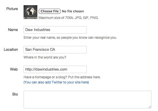
Although you should try to keep your logo graphic as consistent as possible among Facebook, LinkedIn, and Twitter, you may need to make some tweaks. All three services will automatically resize images for you, but each one resizes to slightly different dimensions. For instance, Twitter pictures must be perfectly square and will show up at sizes as small as 25 by 25 pixels, and that can cause problems if your logo has different proportions.
Your Twitter profileYour Twitter profile must be short and sweet, so make it count.
As you can see, the text in the larger Daw Industries logo got cut off when I tried to upload it to Twitter. (That’s probably for the best, though, since the text was too small for anyone to read.) Instead of using this image, I uploaded a square version that contained just the globe part of the graphic.

Get Started on Facebook

Creating a page on Facebook can be a bit involved, but it's still a fairly quick process. Just go toFacebook’s Pages app and click the Create a page button. Next, you’ll see a list of options.
A Facebook business pageFacebook pages are much more visual, so be sure to have some graphics ready.
Depending on what your company does and what you want to promote, you might choose the local business, brand, or corporation button. After you enter your company’s name and industry, Facebook will prompt you to upload a photo for your company. Facebook is unique in that it allows images of variable size. It’s still best to stick to an image with roughly square dimensions, however, as the profile photo will be the basis of your much smaller thumbnail image (which, like Twitter’s picture, is small and perfectly square).
While you’re on Facebook, you should also pick up the vanity URL for your business. Your best bet (if it’s available) is probably facebook.com/yourcompanyname. Once you've created your page, you can start sharing it with customers and friends. For more details on this process, see our guide, "How to Make a Facebook Page for Your Small Business."

Get Started on LinkedIn

Creating a corporate page on LinkedIn is more complex than doing so on Facebook, but easy-to-follow instructions will keep you on track. One warning: To begin making a company page on LinkedIn, you’ll need an email address from a valid domain name attached to your company. Once you have that, it’s a simple matter of going to LinkedIn’s Add a Company page and following the on-screen directions.
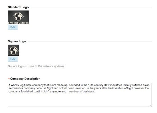
LinkedIn's interface isn’t quite as nice as Facebook's, but the steps for creating a page are similar, if a bit more thorough. For instance, rather than asking for just one image, LinkedIn requests a perfectly square image for thumbnails and a second, “standard logo” image with dimensions of 100 by 60. Don’t worry if your image is too large; as long as it has the right proportions, LinkedIn will resize it.
A LinkedIn profileUnlike Facebook or Twitter, LinkedIn lets you have two separate logo images.

Get Started on Twitter

Twitter doesn’t have specific corporate accounts, but you can easily grab a Twitter account for your company just by registering the name. All you need is an email address. Unlike with Facebook and LinkedIn, you don’t have to enter a lot of information for your Twitter account--just an image, a username, and a 140-character bio. Twitter also lets you customize the background. You can either use one of several preset themes or upload your own background image; be sure to use a subtle pattern instead of your logo, since Twitter will tile the image across the entire page.
That's it: Your social media accounts are now up and running. Be sure to update the content regularly to attract and keep followers.